Tuesday, 14 December 2010

Lesson 18 - Taking initial pictures for the front cover photoshoot

23rd Novemeber

In this lesson, I went to a studio in school to take some preliminary shots. This was so that I could see how the lighting would come out in the pictures and what poses I would like for the front cover.  Here are some of the images that I took:

This is one of the first shots I took so I could work out from the lighting where I would want the character to stand. There is quite a big shadow here, therefore I would need to re-arrange the lights.

In the next few pictures I took I got the character to pose as in my questionnaire, I found out that the readers would prefer to see a posed photoshoot on the front cover.  The interview of this magazine with this character would be generalised on the artist's upcoming music, therefore I had her pose as if she was having fun at a concert.  I made sure that the picture was taken in a portrait way so that it would be useful for the front cover. However, I may use a landscape version of this image in my magazine instead. I also edited the picture to make it look different:


In this picture, the exposure was high and the the studio lights flashed along with the camera taking the photo.
decided to edit the picture as I liked the facial expression that Amy was pulling here. I thought that it would be better if it was a close up shot of her face so I could include it somewhere in the magazine:

Tuesday, 7 December 2010

Lesson 17 - Initial designs for my music magazine

19th November

In this lesson, I started drawing out some designs for my music magazine that are seen below:

Thursday, 2 December 2010

Lesson 16 - Analysing the results of my questionnaire

16th November

In this lesson I went through all of the questionnaires that I gave out and analysed the information I obtained.

The most popular colour that the people chose for the music magazine were red and black.  They also believed that the main focus of the interview with the characters from the front cover will be the artist's upcoming gigs, rather than their background life and information. 
 The cost shall be between £2.00 and £2.99. The main features in this order will be band/artists reviews then upcoming gigs, discounts of gigs and albums, gig reviews and venue reviews.
On the front cover of the magazine, the band/artist will have a posed photoshoot. The magazine will also be produced weekly. After having an equal idea of whether to have the magazine targeted at one gender, I decided that I will target the magazine for the female gender only.

Tuesday, 23 November 2010

Lesson 15 - Questionnaire

12th November

In order to gather information for what my readers would enjoy and prefer in the magazine, I have decided to do a questionnaire. I realised that I need to ask questions based on the look and connotation of the magazine as well as the actual content. Here is my final questionnaire that I will give out to people of various ages so that I can have a wide area of feedback:


Friday, 19 November 2010

Lesson 14 - Choosing the genre of my music magazine

9th November

After researching different music magazines, I have decided on a genre for my coursework task. I looked at the front cover, contents page and double page spreads of three different magazines. I realised that I should base the magazine on a genre that I enjoy the music of.  This would be beneficial for me as I would know more about that topic and it would be easier for me to design a magazine on something I am familiar with.

Friday, 5 November 2010

Lesson 13 - Analysing different music magazines

5th November

In this lesson I looked at different music magazines of different genres in order to gather information and ideas for my coursework.

First of all, I looked at different magazines, their front pages, chode contents and double page spreads. I did this in order to compare the ways in which different genres of music present their magazine.

I looked at 'Q' and 'Kerrang' magazine first because they are similar to the genre of magazine that I would like to create for my coursework.

Analysing the front cover

Kerrang:
'Kerrang' tends to use mid shots for the front covers of musicians that have a main feature in the magazine. This is effective as the muscicans are usually looking in to the camera which may encourage people to buy it.
There is use of smaller images around the magazine in order to show what else is in the content. The same colour scheme is used for the magazine, that being the use of the colours of red, white and black.


Q:
'Q' is a magazine that also uses a constistant front cover style. The colours used are white, red and black.  The magazine varies in the types of camera shots that are used on the front cover. This is done in order to portray different attitudes towards the characters. The target audience for this magazine tends to be people that like the genre of rock. We can tell this due to the seriousness of the expressions of the people in the pictures.


Analysing the Contents page

Kerrang:
There is continuity of the contents page as the same fonts are used throughout the magazine on the front cover and contents page. The colour scheme of yellow and black is used. The magazine tends to use many pictures on the top half of the magazine with the pages and their numbers on the bottom half. 'Kerrang' is a thin magazine, therefore there isn't too much text on the page, however the amount of pictures make up for it.

Q:
Due to 'Q' being a montly magazine, it has a lot more pages and information in it. There tends to be more text on the contents page for this magazine because of the amount of pages there are. The same colour scheme and fonts from the front page are the same to show continuity. This makes it look more professional.


Looking at a double page spread

Kerrang:
When 'Kerrang' has a feature or interview that spreads out over a double page, the editors always use small font and large pictures. This is because of the in depth interviews that 'Kerrang' have with the musicians. There is normally a photoshoot which can extend the interview over three to four pages. A negative about the small font is that it can be quite hard to read; however the dark backgrounds and white font make it slightly easier to read. The small font may put off all kinds of readers from wanting to buy the magazine. In order to emphasise the double page spread, cleverly, the editors set it out so that there is one large image spread over two pages like the one below:


Q:
'Q' is another magazine that uses a lot of text and one or two big images from a photoshoot. Having a lot of text shows that there is a detailed interview which will encourage readers to buy the magazine. If that artist was a favourite of the target audience, they would want to buy the magazine in order to read about them. In a edition I have been analysing, I can see that the magazine has continuity in the style of photo that has been taken in the photoshoot. Here are images of the front cover of 'Q' magazine and the interview with Noel Gallagher:


When creating my magazine, I need to think whether I would want to design it based on a large or thin magazine. At the moment, I think that I would like to design a contents page that has more images than text as I believe it would appeal to more people of my target audience. Also, I will take a lot of pictures myself when I attend concerts.
I must be careful when taking my picture for the front cover of the magazine as I need to think in detail who I want the target audience to be. For my initial ideas, I am thinking of having the lead singer of a band which will show that there is an interview with her inside. This will then be my double page spread.

Lesson 12 - Starting our AS Media Music Magazine

2nd November

In this lesson, we have moved on to thinking about our music magazine for our coursework. First of all, as a class we grouped together to go into detail of all of the different types of music genres in the world today. 
Here is a list of a few that we named: Alternative, Indie Rock, Pop, Deathcore, Country, Dance, Folk and Classical.
I decided that for my music magazine, I would do a genre that I recognised and was familiar with. Therefore I have chosen to make a magazine for the genre of rock.

Thursday, 28 October 2010

Lesson 11 - Creating the final design for my preliminerary school magazine

22nd October

After getting feedback from other students and my teacher, I decided that there could be some improvements on my magazine.
I realised that because there was so much going on in the picture, there was no need to have so much text on the front cover.
There was also the problem of having white text on a light background. The words "Beaverwood School For" weren't very literate.
I thought that it would be better if I re-arranged and changed some of the text in order for it to be more readable.
Here is an image of my final design:


I thought that I would darkern the overall look of the magazine in order to make the colour stand out. We can clearly see the red of the blood and how it links with the text on the page. I thought it looks better now that I have removed some of the text so that the image itself is still as powerful. I think its good how I have used the text font and colour to connote the sense of death in the magazine.

Monday, 25 October 2010

Lesson 10 - Editing the images and creating the first draft of my magazine.

19th October

I decided that I wanted to emphasise some of the colour in the image before I added in the text. First of all, I added a grey colour to the overall image. I did this because I felt that it would then allow the other colours to stand out more. In the original photo, the make up of the two scare characters was very faded. I then added an effect to their faces so that the white and black colours were stronger, as well as the blood.
I added a colour to the eyes of the school girl character. I felt that it would add more of a scary look to the magazine.


I added text to the magazine front cover and this is what I created for my first draft:


I went on to analysing this magazine for features that I could improve. First of all, I liked the font of the title, however the "wood" part of the word was faded and it wasn't that visable. I decided that I wanted this text and fading to make it look as if it is part of the image.
The next part that I decided that I needed to change was "Beaverwood School for". This is because it is on a white background and isn't that visable.
After getting feedback from classmates, I agreed with them that I have added too much text to the magazine. Seeing as there is a lot going on in the picture, the reader will focus on that instead of looking at the unwanted text on the front.

Lesson 9 - Drawing designs for my front cover

15th October

 Before I started editing my images and editing text for the front cover, I drew some designs.


(scan in image)

Friday, 15 October 2010

Lesson 8 - Taking pictures of different scenes for the contents page

12th October

I took pictures of different areas for another image to insert into the contents page.
First of all I took a picture of the bell tower as it can be seen as scary and daunting. However, after editing it, it still didn't look how I wanted it to:


I then took a picture of the quad, however I think the scene seems more picturesque instead of scary for the theme of halloween:


My final picture I took was in the main corridor which I then edited:

Lesson 7 - Taking my pictures for the front cover and contents page

8th October

After looking into where I should take my photos, I then took photos of different areas with people in.
My first shots were in the quad.
I decided not to use this image and scene because the lighting was bad for that time of day. The effect of this was that the faces of the characters because shiny and blurred.

After that, I then took a picture in the main entrance but I didn't take enough pictures to get a good one. The picture wasn't in focus and the characters didn't have the right facial expressions:


I then moved to the final scene, that being the main corridor where I managed to get my final shot:

Tuesday, 5 October 2010

Lesson 6 - Moodboard of initial designs

5th October

In this lesson I thought up of ideas for my magazine. I sketched out some deisgns and made a moodboard of the sort of things that I might include.

Seeing as the theme of the magazine will be Halloween, I wanted to include pumpkins in the scene. To make the the front cover give off the 'horror' vibe, I thought it would be a good idea to make the girl of the midshot have scary make up on. I then decided that I could have additional people in the far background with pumpkins on their heads to have them walking around looking like zombies to add to the effect.

Lesson 5 - Deciding on a theme for the magazine and analysing my questionnaire

1st October

I thought that in order to attract my target audience I should create a theme for the magazine. My initial ideas were Halloween, Christmas, Autumn, Fireworks night and New Year. The feedback I got from the questionnaire shows that most people in year 10 and 11 would want to have a magazine designed in the theme of Halloween as it is coming up.

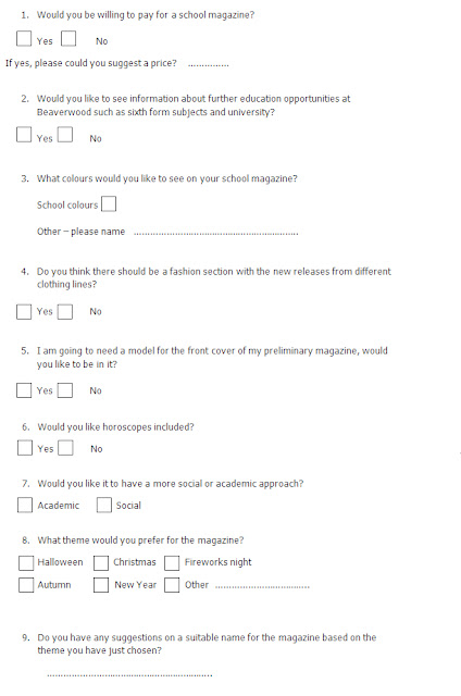
From the results of my questionnaire, I found out that the majority of the people wouldn't pay for the magazine, therefore I made it free. 7 out of 10 people wanted more information about further education opportunities such as sixth form, college and university. Users also wanted a fashion section in the magazine, therefore the magazine in general will be educational and social. The most popular theme selected was halloween, therefore the colour scheme I will be using is red, oranges and blacks.

I didn't get much feedback on the question about naming the magazine based on the theme they had chosen, therefore I named the magazine myself, "Scarewood".

Tuesday, 28 September 2010

Lesson 4 - Deciding on the target audience and questionnaire

28th September

I have decided that the target audience for my school magazine would be for the girls in Years 10 - 11 of Beaverwood School For Girls; many of whom already read magazines, therefore I've chosen them as my audience.
As I have just come out of this age group, I believe I have an advantage of knowing what they would want to see in a school magazine. I will carry out a questionnaire for the girls so I can make sure that what they want is up to date with my ideas.

I am going to include information about their upcoming exams, however I must make sure that I do not fixate all of the magazine about exams as they would like to know about other topics such as social events. So that they can start thinking about further education, I will talk about Post 16 opportunities at Beaverwood.

Below is an image of my questionnaire:

Lesson 3 - Finding a location for the front cover

24th September

In this lesson, I walked around the school to find the best location for the front cover image. The places that I went to were: the front of the school, the new technology building, the quad, the sixth form block and the main hall corridor.
I have taken images of each place so that I could see which I think looks better for the cover.

The Quad: I liked the idea of the quad for the theme of either Halloween or autumn. I think that it is a suitable place for the pictures as it shows the picturesque historical side to the school. This can also be seen as a 'scary' look if I were to do a Halloween theme; I could edit in images of pumpkins or include actual pumpkins amongst the leaves.
The leaves in the quad would look good for the autumn theme for a back to school edition. However, there are negative points to 'the Quad' scene. I would have to make sure that I take my pictures before, during, or after lessons as it can be filled with students so I must plan my time effectively.


The front of the school: I think that the front of the school would be a good image to have as the front cover of the school magazine as it is what people relate to when they think of Beaverwood School for Girls. However, I think that this approach would be more suitable for younger years of the school. It would be hard to take the pictures at the right time as you do not want other students or cars in the scene. Therefore it would be harder to organise a suitable time to take the picture. The scene of the front of the school would be better if a mid-shot of a student wasn't included as there would be too much going on in the picture.

The new technology block: Once again, I think this scene would be better for the younger years of the school showing how the school is developing. It doesn't have much relation to the Halloween theme that I am considering. However, it would be good for the autumn theme, showing what changes there have been over the summer holidays. A negative is that there is a lot of litter in front of this building so I would have to clear that up.

The sixth form block: This would be a good scene for the upper school as it is showing the opportunities that they will have in the next year or so. A negative point to this scene is that the common room can be quite messy so would be hard to take decent pictures.

The main corridor: I believe this would be a good idea for the theme of Halloween as the scene can look quite frightening.


After analysing the pictures, I think the best place for the front cover would be the quad or the corridor depending on what the outcome of the questionnaire is. The Quad scene is significant for the year 10 and 11 students because they will spend a lot of time there because of their exams; therefore I believe it would be a good and effective design for the autumn theme. I would also like to use the image of the main corridor for the Halloween theme as it can look quite daunting with the right editing. I would also use the quad scene for Halloween. If I were to do an autumn theme then I would definitely use the quad. I might include whichever scene I do not use into the contents page.

Saturday, 25 September 2010

Lesson 2 - Researching school magazines

21st September

In my second lesson, I analysed different school magazines. I did this so I could see what people include for specific target audiences and for some inspiration to my ideas.

Lesson 1 - Introduction

17th September

For our prelimerary coursework task we are assigned to design and create a school magazine cover and contents page. I am going to use this blog to write what I do each lesson for my AS Media coursework. It will contain information about my designs, feedback from others and reasons for editing ideas. In my next lesson, I will research school magazines and analyse them; I will develop ideas for my magazine.